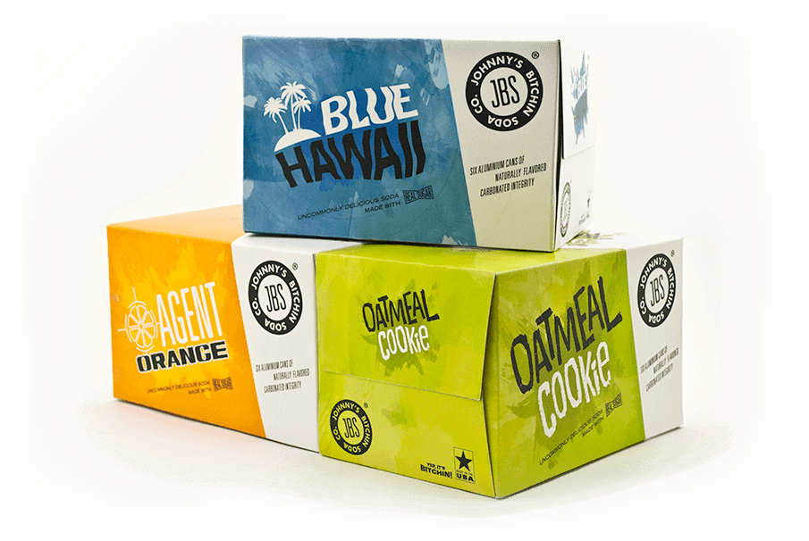
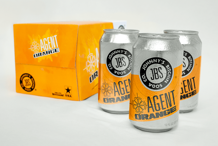
JBS Soda Co.
The brief for JBS Soda required packaging design for six-packs as well as branding from the ground up. Inspiration was taken from recent solutions in the craft brewing industry (cans + boxes) to set JBS apart from competitors in the grocery isle. Ditching the plastic rings for a recyclable cardboard alternative was an environmentally friendly decision that came with the added benefit of a larger canvas for the design to command attention on the shelf. This was a student project.
Inspiration
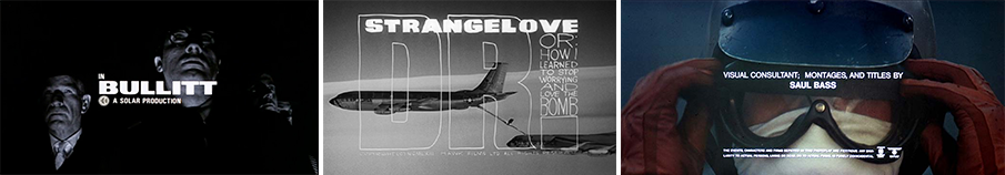
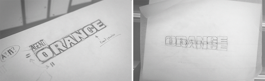
Design for this project was heavily influenced by film titles from the likes of Saul Bass, as well as movie posters and comic book culture from the mid 20th century. Here are some shots of the early type development for Agent Orange, which was inspired by title sequences for Stanley Kubrick's Dr. Strangelove, as well as Bullitt starring Steve McQueen.
Flavor Logotypes
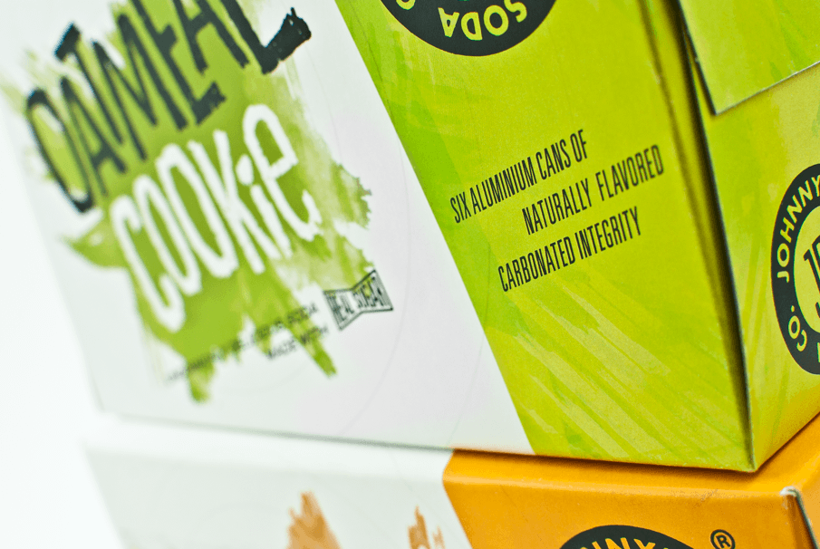
All the flavor logotypes were created and refined by hand before bringing them into Illustrator. Oatmeal Cookie in particular was written out in charcoal, scanned, printed, crumpled up, stomped on, yelled at and scanned again before being live traced. This gave it a realistic distressed texture.


The Finished Product
The boxes are recognizable as a cohesive system and distinct enough to set them apart from eachother. Special attention was give to the choice of colors to create a harmonious and energetic pallette that remains strong as any combination of one, two or all three parts.