Ratio Brand
Following a merger between Ratio Interactive and Cypress consulting, I was tasked with creating a mark for the new agency to be named simply, Ratio. Both companies had been located a few blocks away from each other in downtown Seattle and now shared two floors in Cypress' building. Leadership was looking for a mark that was simple, trustworthy, and friendly.
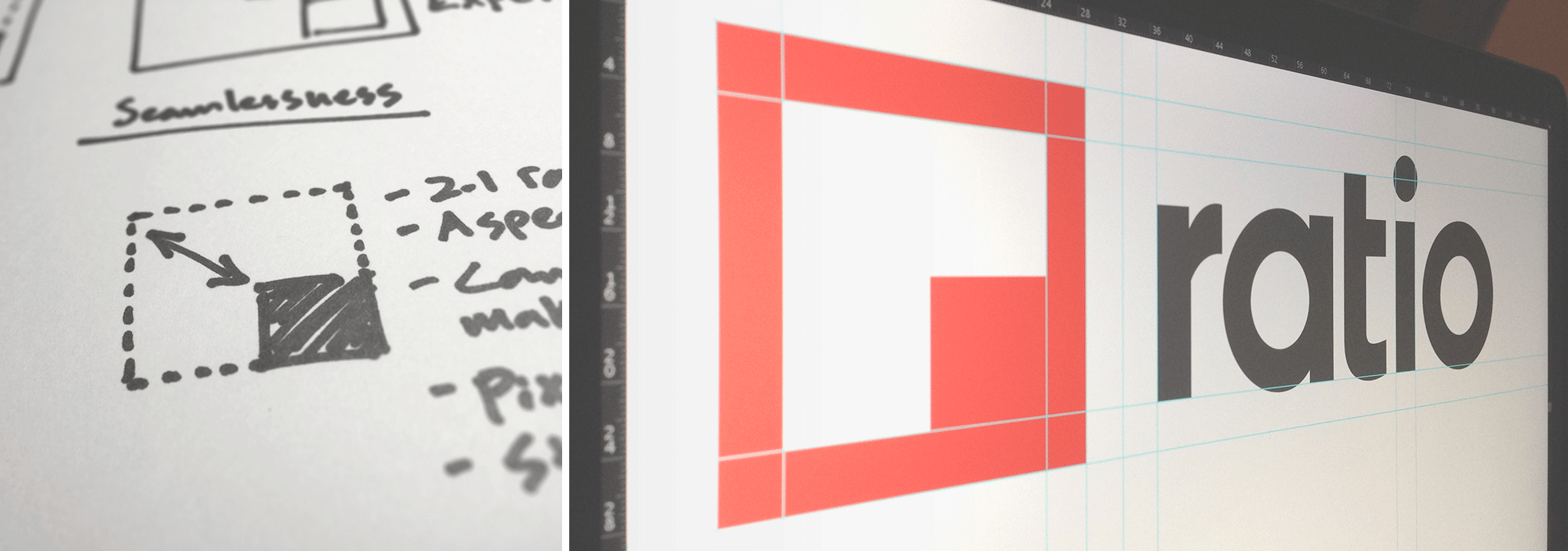
Research & Process
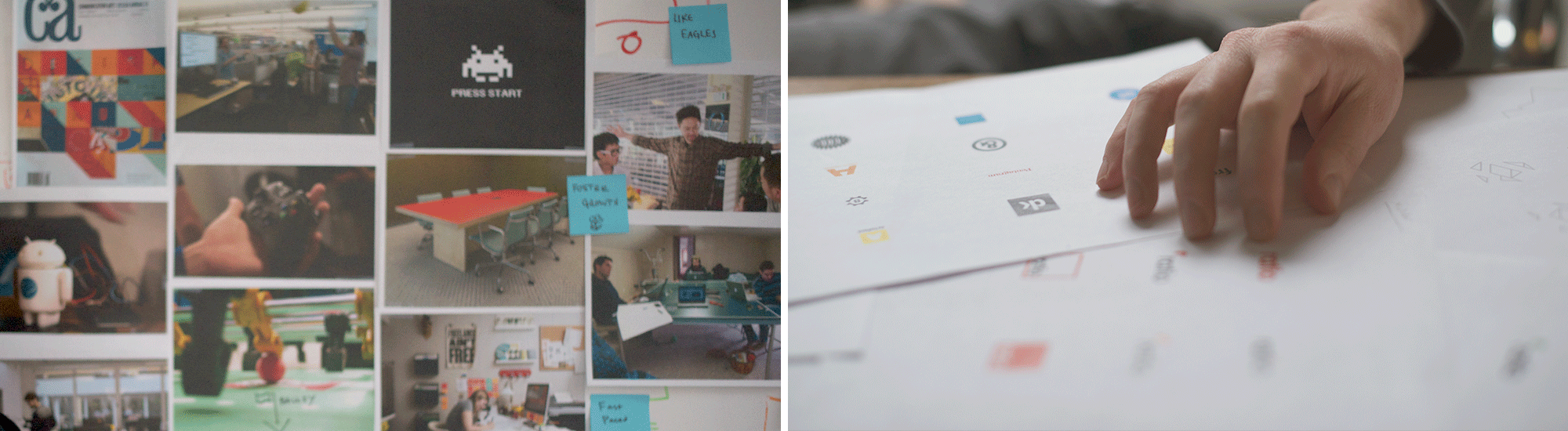
With the aid of moodboards, competitor analysis and brand descriptor exercises, I created piles of sketches and variations. Leadership was attracted to strong angular shapes and bold colors, which I balanced with approachable type and imagery. I worked with my fellow designers and the leadership team to eventually narrow the concepts down to one successful direction.
Personality + Rhetoric
A logo isn't going to do everything. I emphasized that special attention should be given to creating personable copywriting and rhetoric as the brand continued to live and thrive (read: let's be friendly humans, and get to the point. Don't try hard to look badass and impress people with acronyms). It's important for a business to develop a personality through its voice and imagery. To exhibit meaningful trustworthiness, a company should establish credibility through quality of work and interactions with the public, not by slapping client logos on their footer.
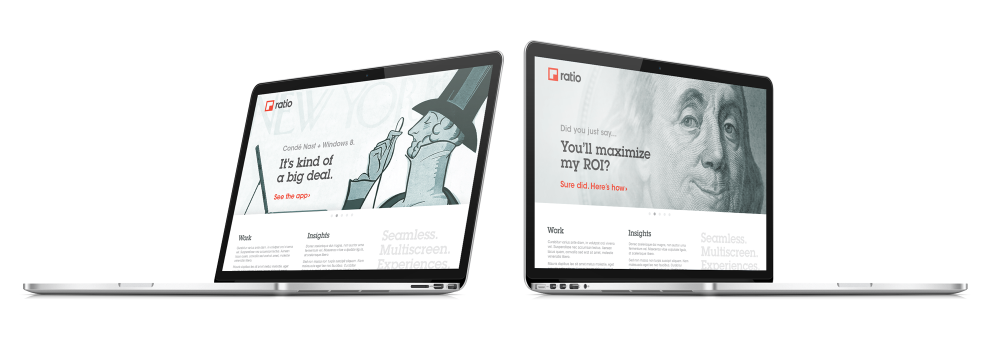
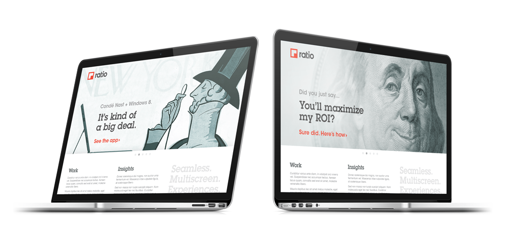
Refinement + Application
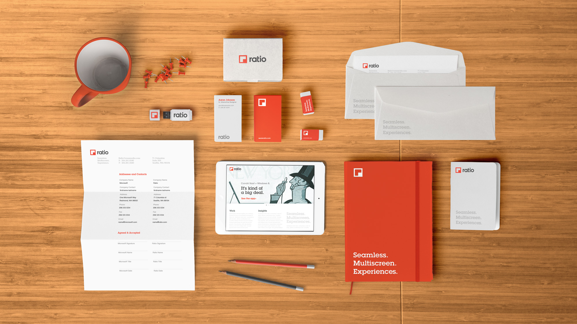
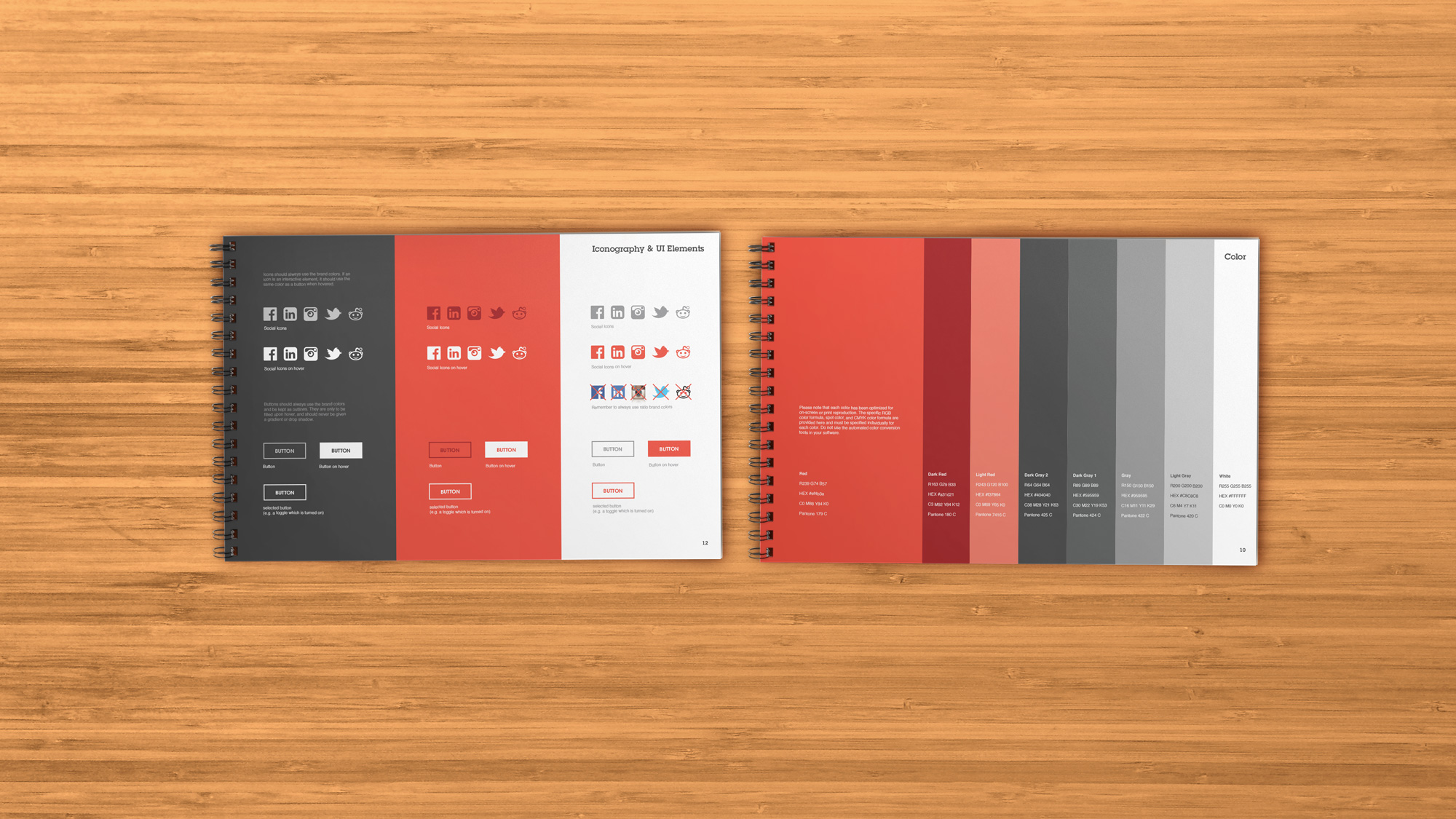
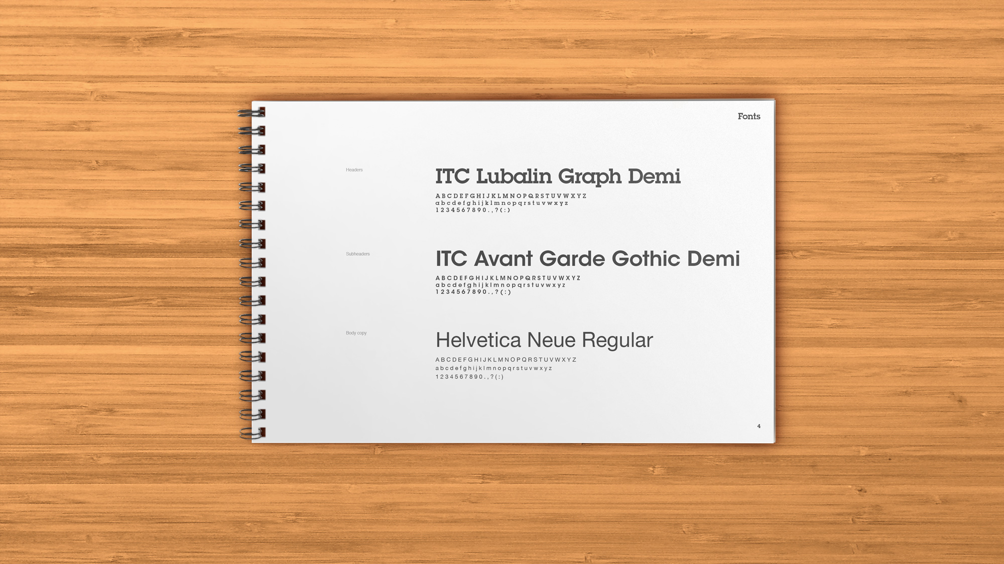
The mark was paired with a completely custom logotype from which it could be separated depending on the application. Put simply: if your audience has had low exposure to the brand, keep the type. I worked with designer Aaron Johnson to refine the brand colors and create an extensive 20 page brand guidelines document detailing logo use, web and print applications, photography and presentations.